CHALLENGE: conceptualize and develop a UI for Hobbees, a mobile application for users to find, build, and share hobbies and skills (for the full brief, see this PDF).
SKILLS APPLIED: UI/UX interface ideation & development, wireframing, prototyping, group collaboration, Adobe XD
MY ROLE: UI Design & picking up slack
See this document for submitted design report
User Research
In order to better understand and gauge what potential users would want within a content sharing app, we conducted brief, informal interviews with individuals who would be interested in this product. Due to restrictions on who we could reach (due to COVID-19), our interviewees were friends. In total, we interviewed ten people (8 female, 2 male) between the ages of 19 and 23.

While we did not follow a formal script, we used the following questions to guide our research:

What content sharing app(s) do you currently use?
What features of this app do you like?
What features do you dislike?
How satisfactory is the experience of using this app?
What would your ideal content-sharing app look like?
From these interviews, we discovered that users already utilize many different kinds of content-sharing applications to learn new hobbies and skills. For example, many participants mentioned their newfound reliance on fitness apps since COVID-19. Others mentioned using apps like Pinterest and Reddit to learn new things and save content. Instagram, particularly Instagram live, was another source for finding tutorials.

On apps they currently use, people liked when they can reach information in a quick and concise manner. For example, following videos that are short and easy to follow, like “ten easy steps baking videos”. Another interviewee mentioned how Instagram live workout videos have allowed her to get in a great workout under 30 minutes. 

Another common positive of many of the aforementioned apps was the customizability of the app to cater to the users’ needs. The explore and recommended-for-you sections, which are based on the user’s likes and history, were generally well-received by the people we interviewed. One person mentioned that they liked that on Pinterest, for example, they could select particular areas of interest and their page would populate accordingly.

On the flip side, a common downside to many of these applications was the overflow of information that sometimes crowded a page. “I love Instagram live videos but hate the live comments that take up half the screen,” stated one interviewee. Another interviewee mentioned how she loves Peloton but hates that she has to always scroll to the particular section she likes, which is low on the long list of many sections. We came to the consensus that people generally want their desired content to be visible, and they want it nearly immediately. 
UI Structure Development
SOCIAL MEDIA CENTRIC APPLICATION
This social media-centric approach provides a perfect space for users to express and share their interests across the platform. This concept focuses on social engagement factors, where feeds and classes gain traffic through shares, saves, and messages. Aspects of engagement include: exploration of contents, hosting classes, joining live classes, and messaging other users. Shares measure the engagement of distinct users. Messages boost interaction within the community. The explore page, coupled with a "save" feature, allow users to curate their content as they like and engage with the content repeatedly. This concept encourages exploration, focusing on strong visual elements, thumbnails, and easy browsing.
Wireframes
Moodboards
MOODBOARD 1: COLORFUL GRADIENT

This design direction is colorful and playful. The line art with offset illustrations creates a dynamic artistic expression to the overall creative theme of the design. The use of gradients provides a subtle dimension to elements. The opacity lets the colors blend with design elements such as background, texts, and images. It creates a sense of transition and the use of bold colors blended with soft colors creates a uniquely energetic and attention-grabbing feel.

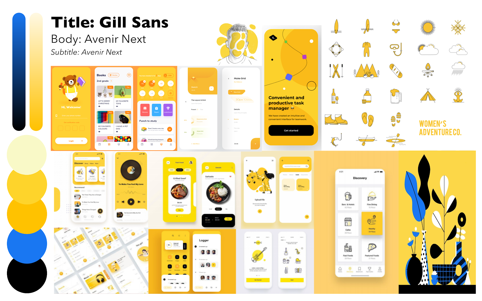
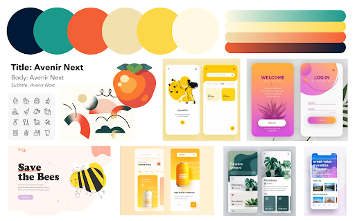
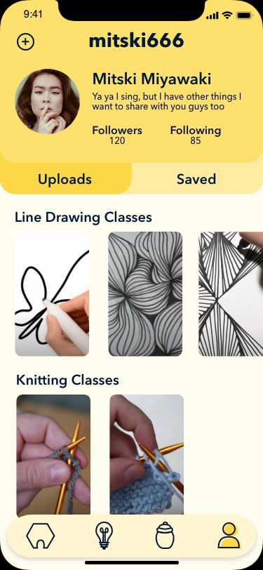
MOODBOARD 2: HONEYSUCKLE MONOTONE

This mood board plays on the “bee” aspect of Hobbees with its primarily yellow color palette. The base of this monochromatic color starts with base, shades, tints, and hues of yellow. This direction creates a sense of minimalism and harmony. The splash of blue is meant to draw attention to smaller features as it complements the yellow tones. This board elicits a light feel with its soft shapes, simple colors, and clean line design.

Final Mockup
Prototype

OTHER PROJECTS

Back to Top