CHALLENGE: showcase the breadth and depth ofWikipedia’s content by conceptualizing a website centered around a Wikipedia page. Using WikiRoulette, choose a random topic (in this case, cocoa beans) and then develop a concept around that topic.
SKILLS APPLIED: UI/UX interface ideation & development, wireframing, prototyping, Adobe Illustrator, Adobe XD
See this document for submitted design report
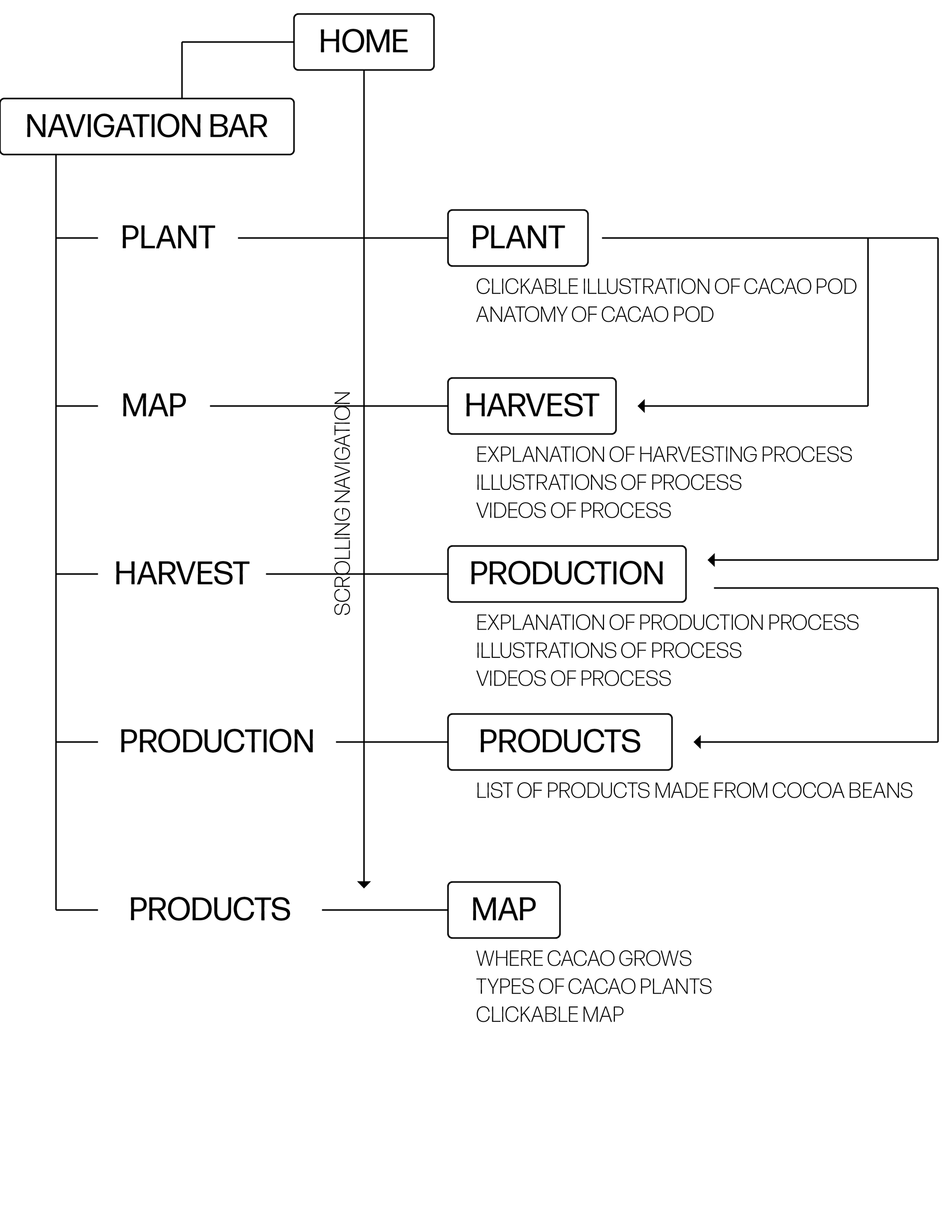
UI Structure Development
I chose to conceptualize a site that gives the user everything they need to know about how cocoa is produced. I chose this site because cocoa production is an elaborate, interesting process that many people don’t know about or understand, but is essential to the delicious taste of cocoa. This site will provide people with the information that a factory tour of a chocolate company may provide, but all from the comfort and ease of their own home. They can explore the information on their own time, while still engaging with the material. Moreover, there is an increasing desire in the general consumer base to know exactly how our food is made, so I want to provide a resource that helps consumers learn about just that. .
Wireframes
The heading on each page matches that in the navigation on the right side of the screen for consistency and an easy navigational system. Consistent placement, font, and spacing of the header carries throughout each section as well. The navigation bar is vertical to match the scrolling action of the user, with bolded areas shifting with the scroll. This provides the user with a sense of how the site is laid out, where they are in it, and a way to move around between sections. The landing page also has a “scroll down” icon and label at the bottom of the window to communicate this scroll function.
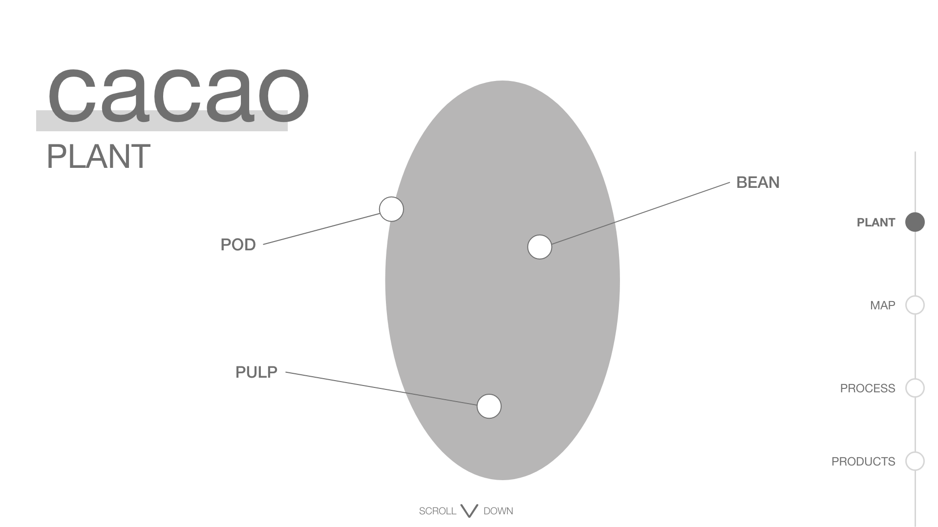
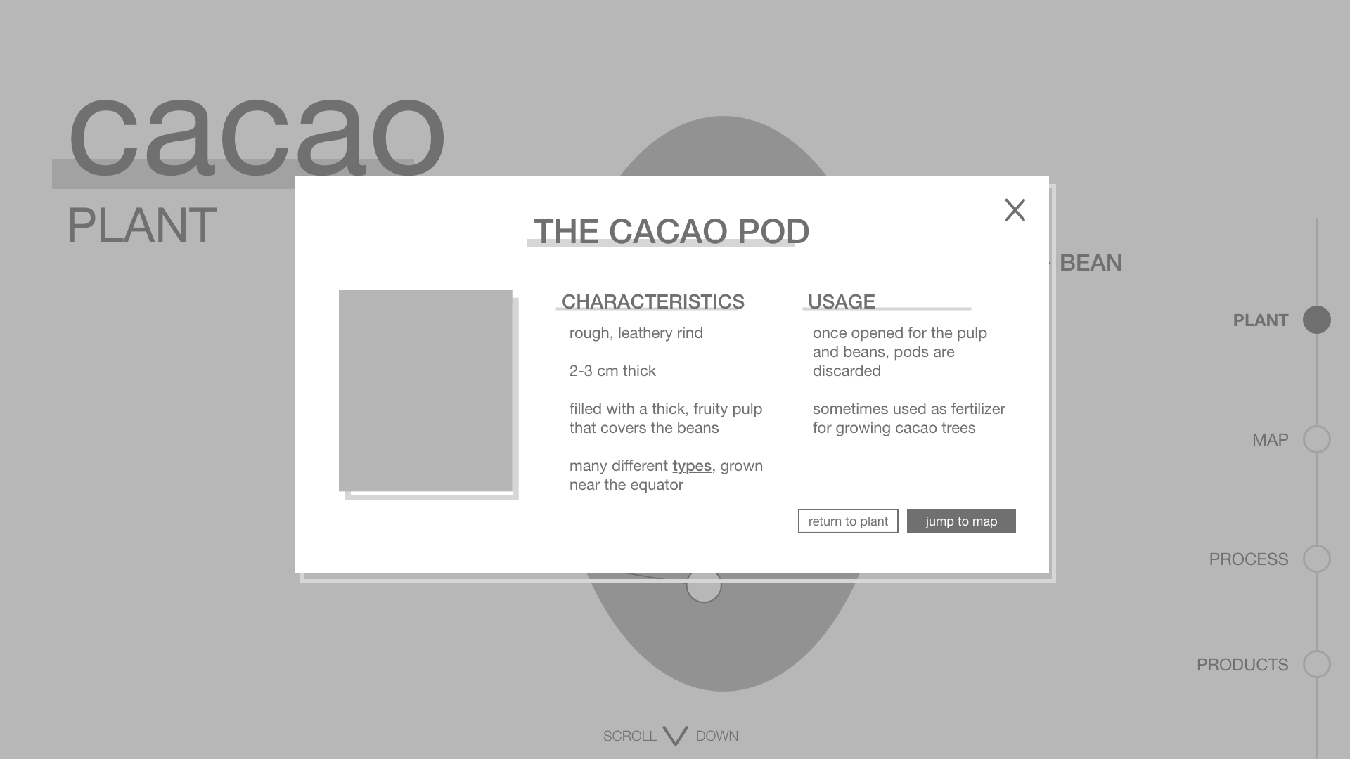
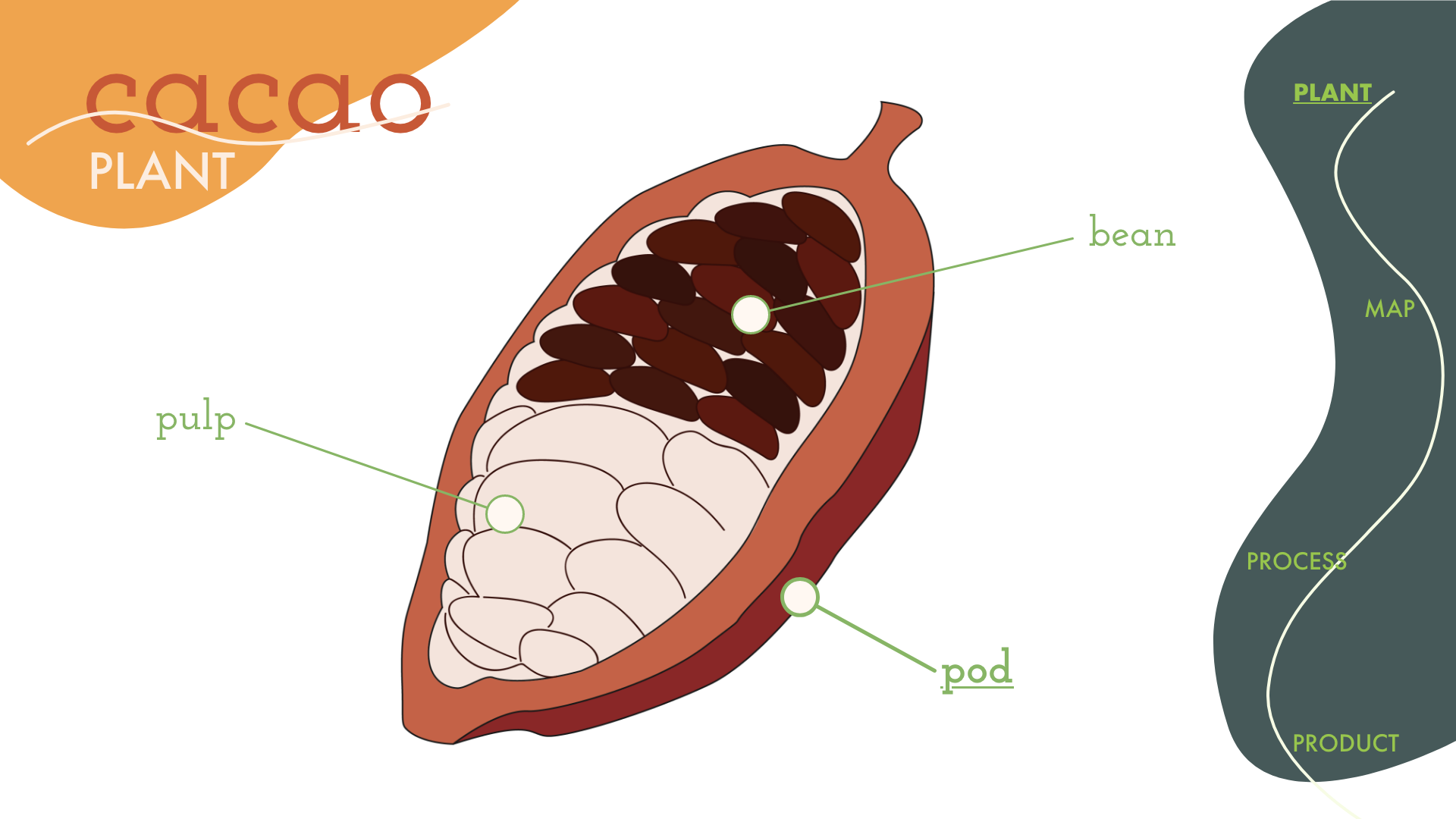
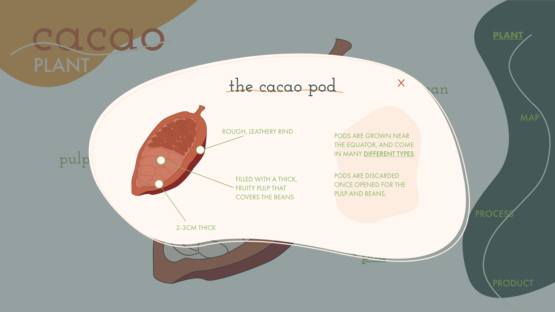
PLANT PAGE
This screen features an illustration of a cacao pod, with each significant part labeled (the pod, the pulp, and the bean). This is also the landing page, immediately engaging the user and asking them to interact with the site and learn about the cacao plant as soon as they enter the site. When the user clicks on one of the labels, they are presented with a popup window (shown here), providing some general characteristics and information about the usage of that part of the cacao plant, and a link to the corresponding step the “process” section of the site where that part is (first) used. There is an “x” in the top right corner so the user can leave the popup, and the background is grayed to focus the eye on the present information. The buttons at the bottom of the popup allow the user to either close the popup or jump to the “map” section of the site.
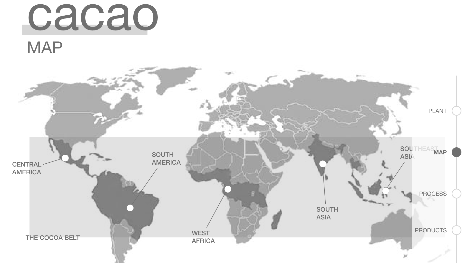
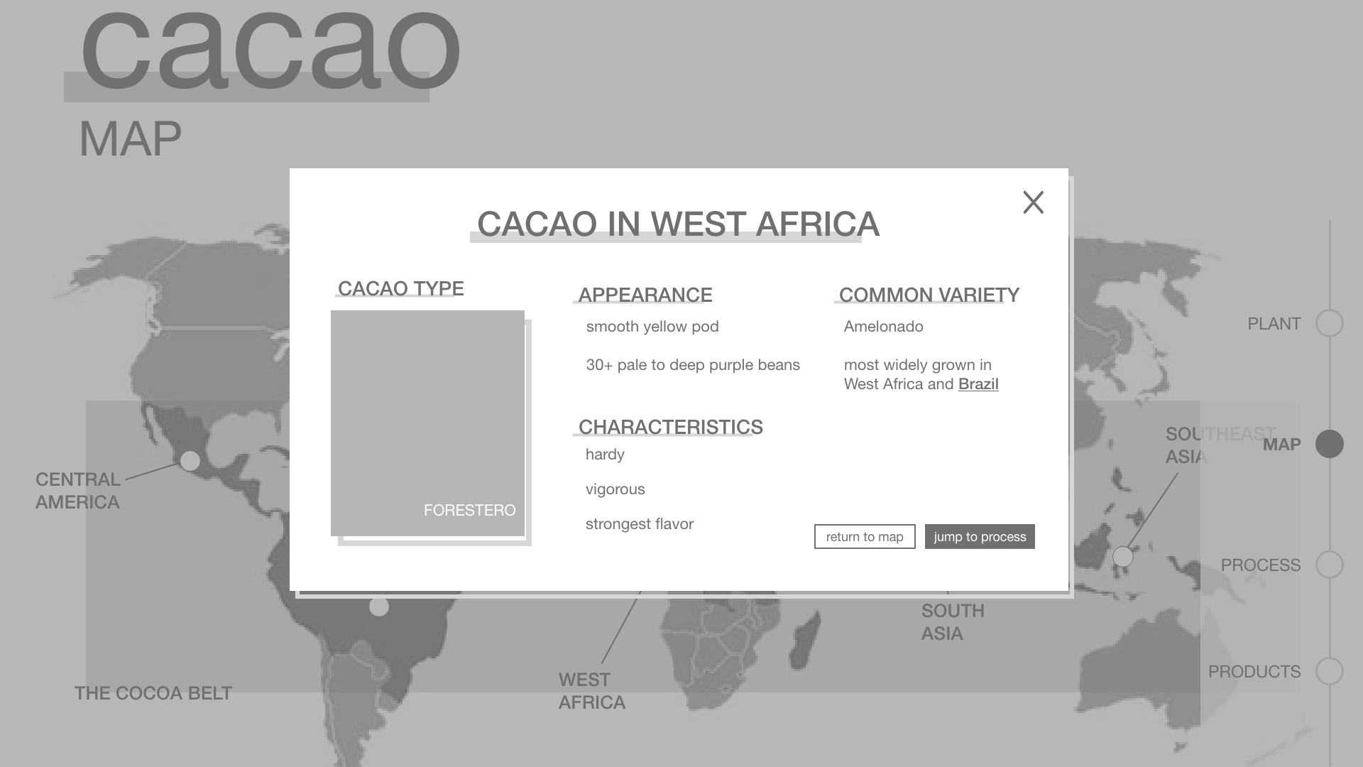
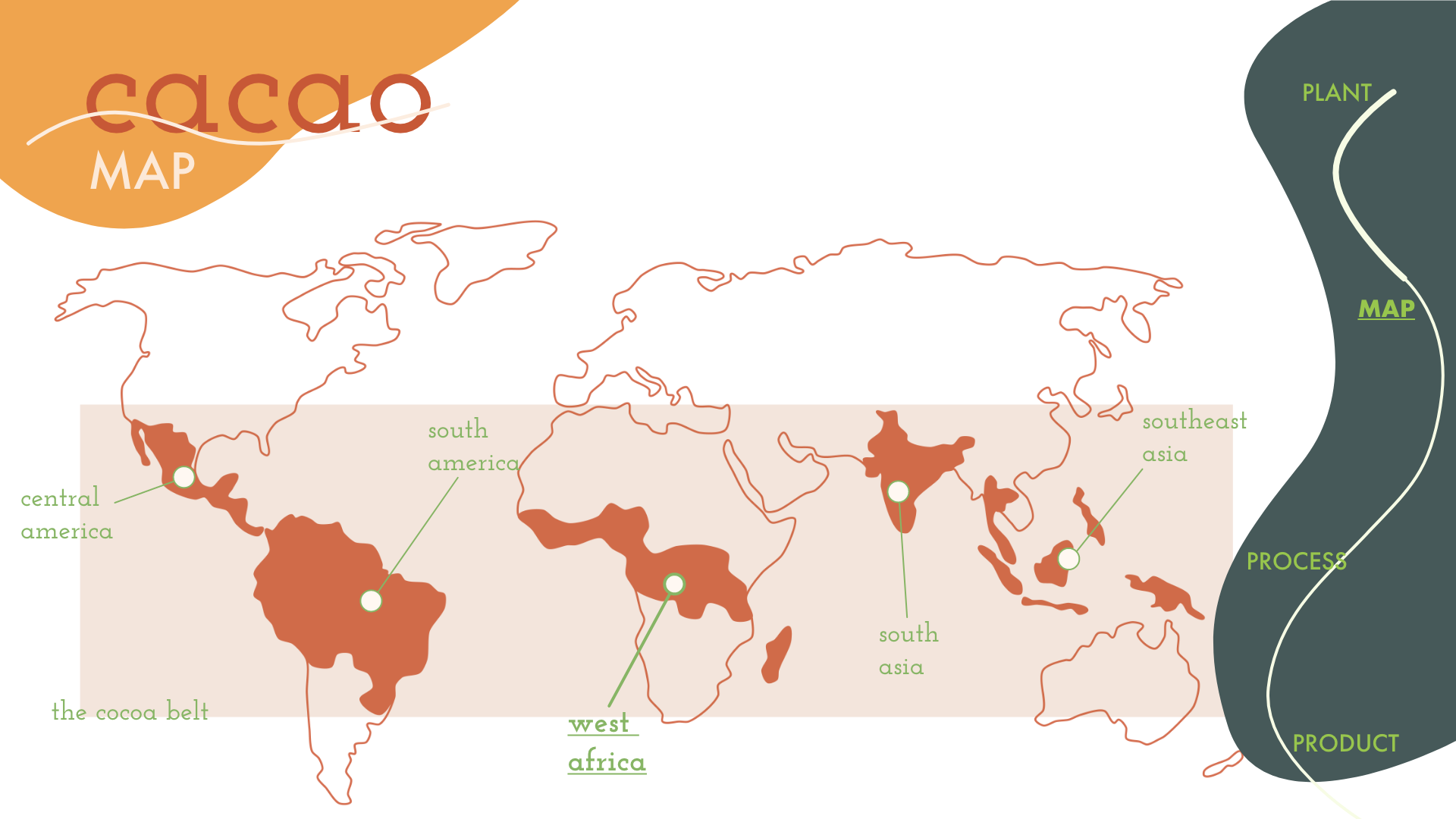
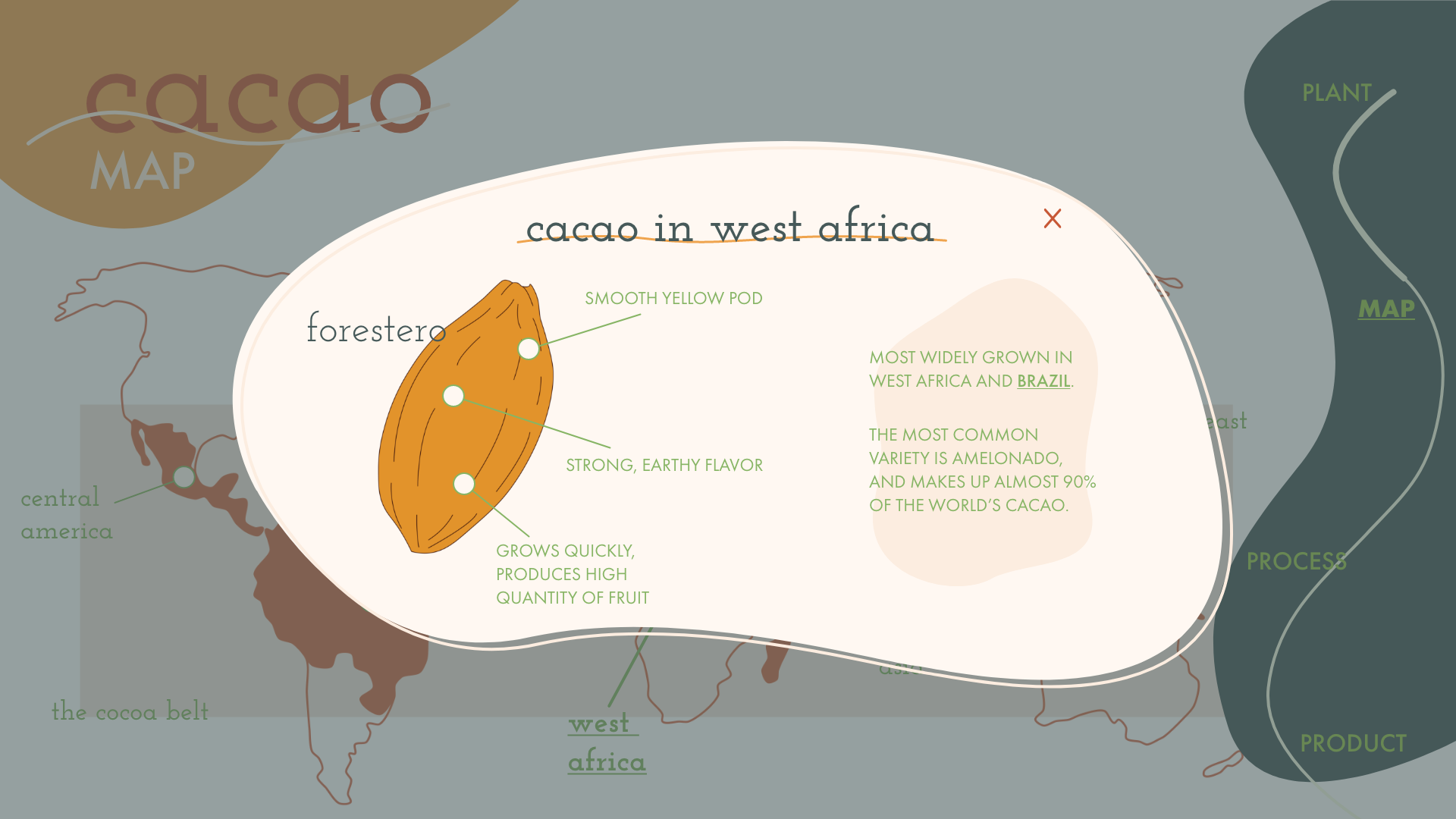
MAP PAGE
This screen features a map of the regions where cacao grows, with labels pointing to the main regions of growth. The regions with cacao are shaded, and “the cacao belt”, where all cacao in the world grows, is highlighted and labeled. When the user clicks on one of the labels, they are presented with a popup window with more information about the type of cacao that grows there. This includes an image of the cacao pod, its general characteristics, and where else that type of cacao grows. This information is linked so the user may choose to view information about that place. The buttons at the bottom of the popup allow the user to either close the popup or jump to the “process” section of the site.
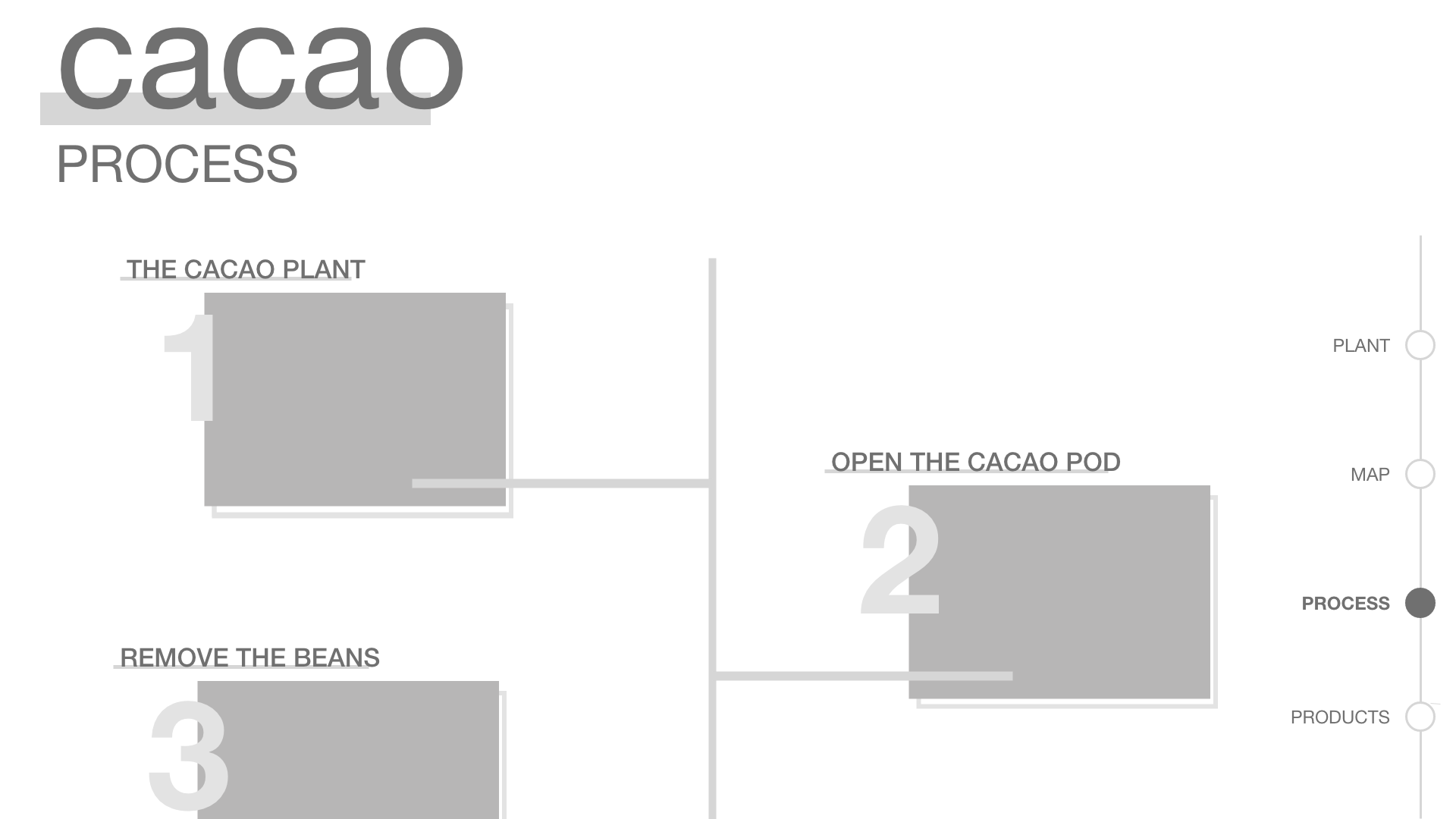
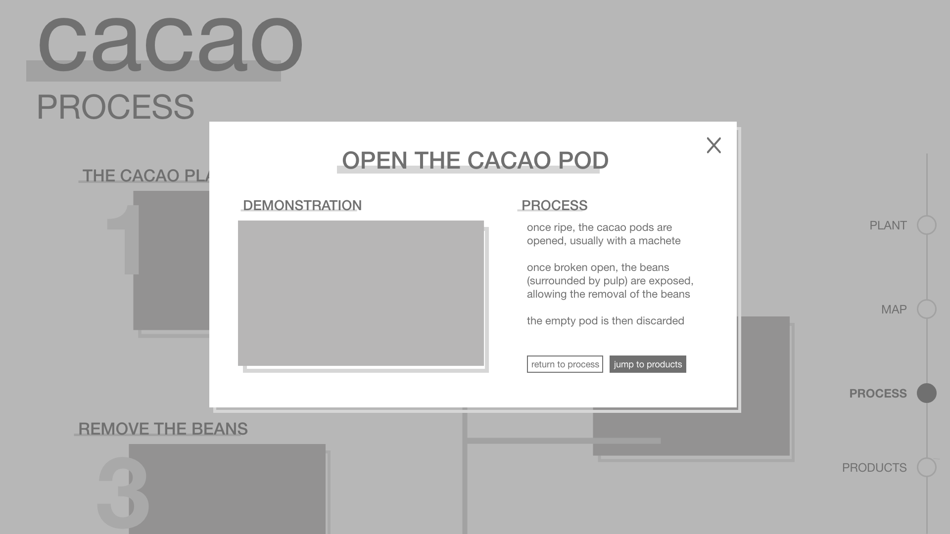
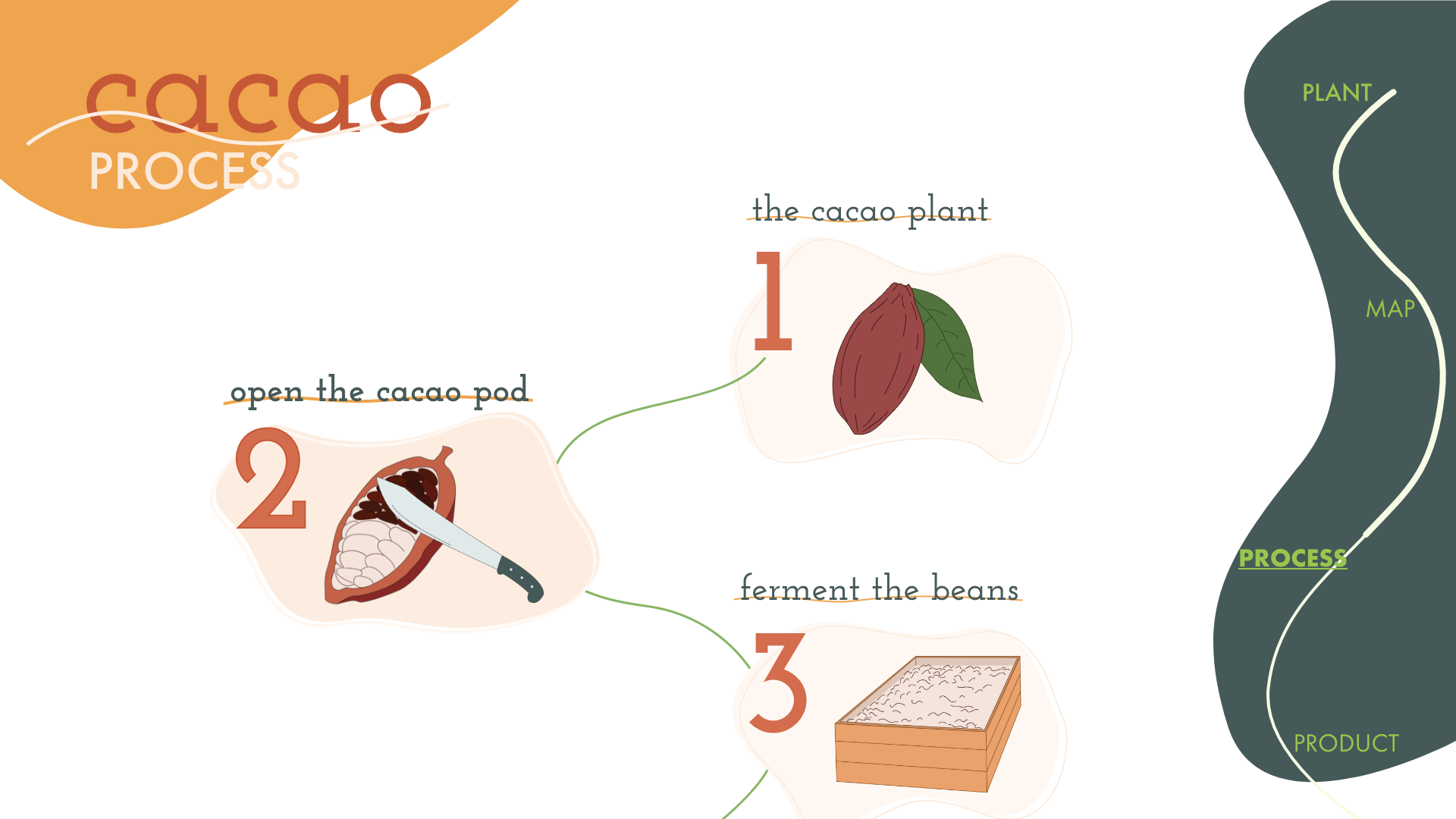
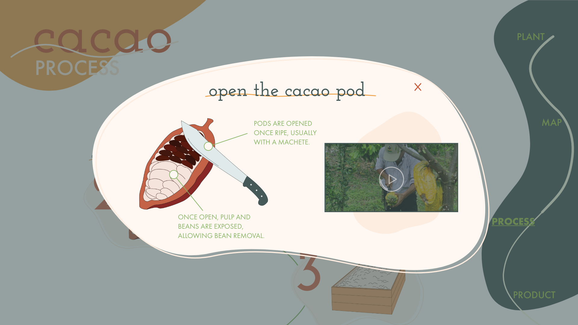
PROCESS PAGE
This screen features a timeline-like organization, bringing the user step by step through the process of harvesting and producing cocoa products. Each step is clearly numbered, labeled, and illustrated, so the user can easily follow the progression from start to end. Moreover, minimal writing is provided out-front, so the user can go through the process quickly if they wish. Illustrations are included (shown here with the dark gray squares) so the user can get a visual idea of what each step entails, without necessarily having to read more about it. When a user clicks on one of the steps, a popup window will be shown with the same formatting as the popups in the “plant” and “map” screens, providing more detailed information about that particular steps. This popup will also feature a video explaining the process for those visual and/or auditory learners, and to show a real-life example of cacao farming/production.
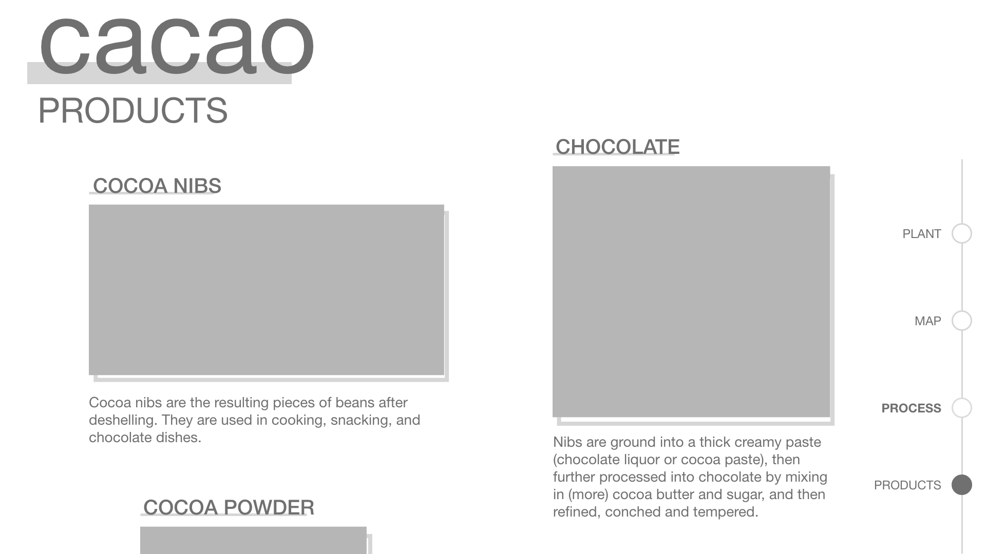
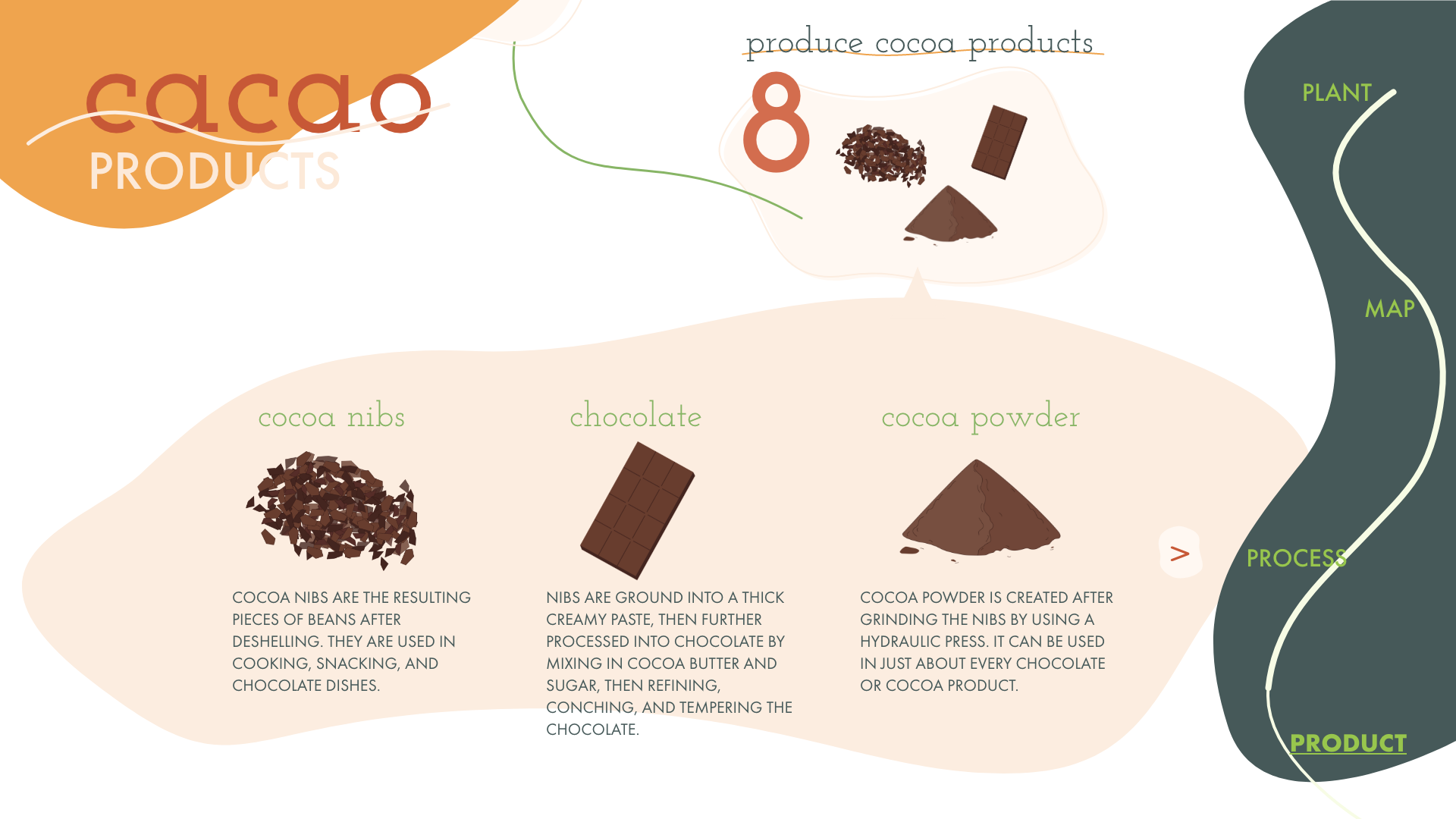
PRODUCTS PAGE
product, the user will find an explanation of where in the production process this product comes from, and how the treatment of the plant impacts the taste, texture, quality, etc. of the cocoa. The screen is laid out in a very simple, article-like/gallery design, so the user can easily browse. This is placed right after the “process” screen, so the user can use what they’ve learned throughout the site and apply it to products that they may be more familiar with.
Moodboards
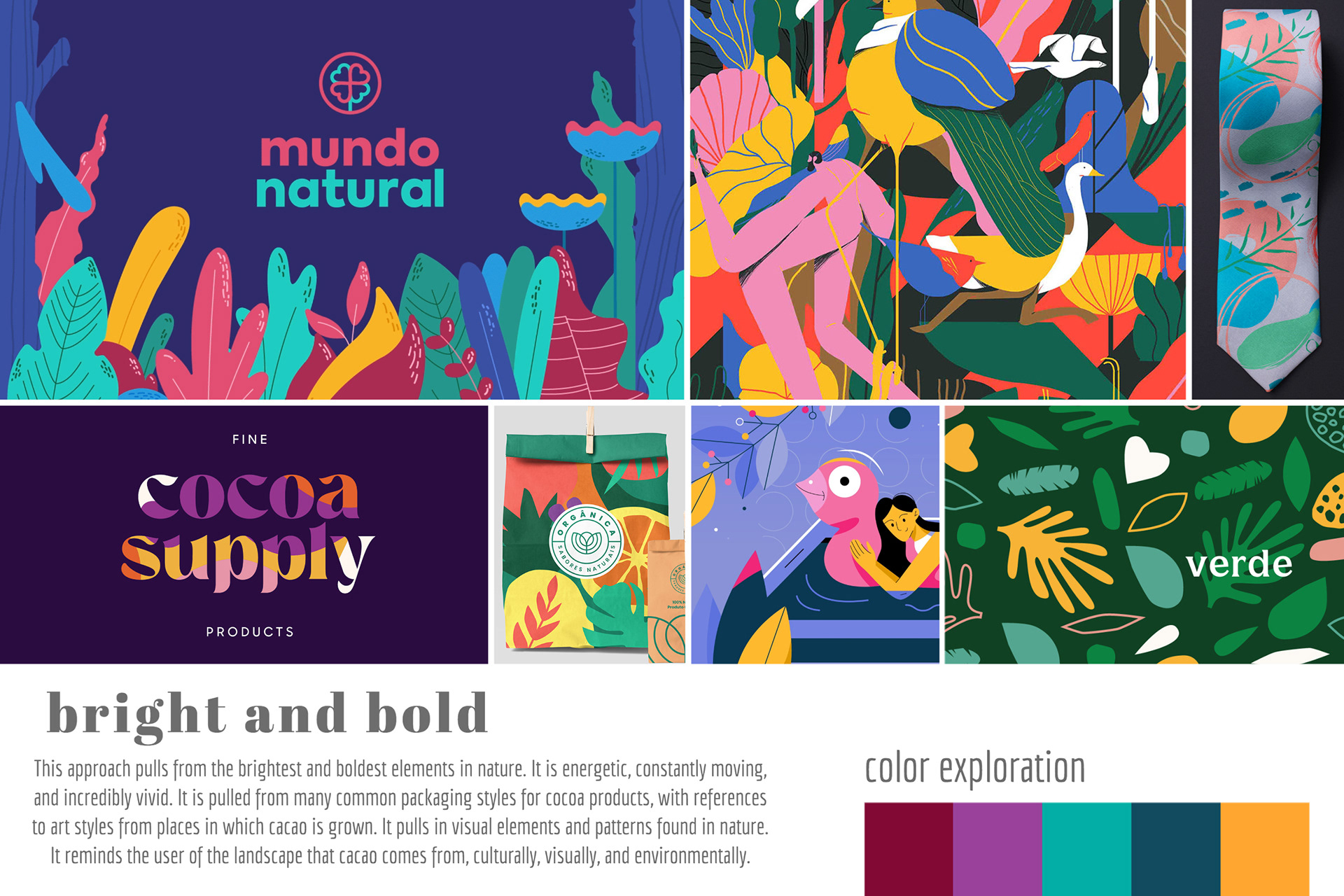
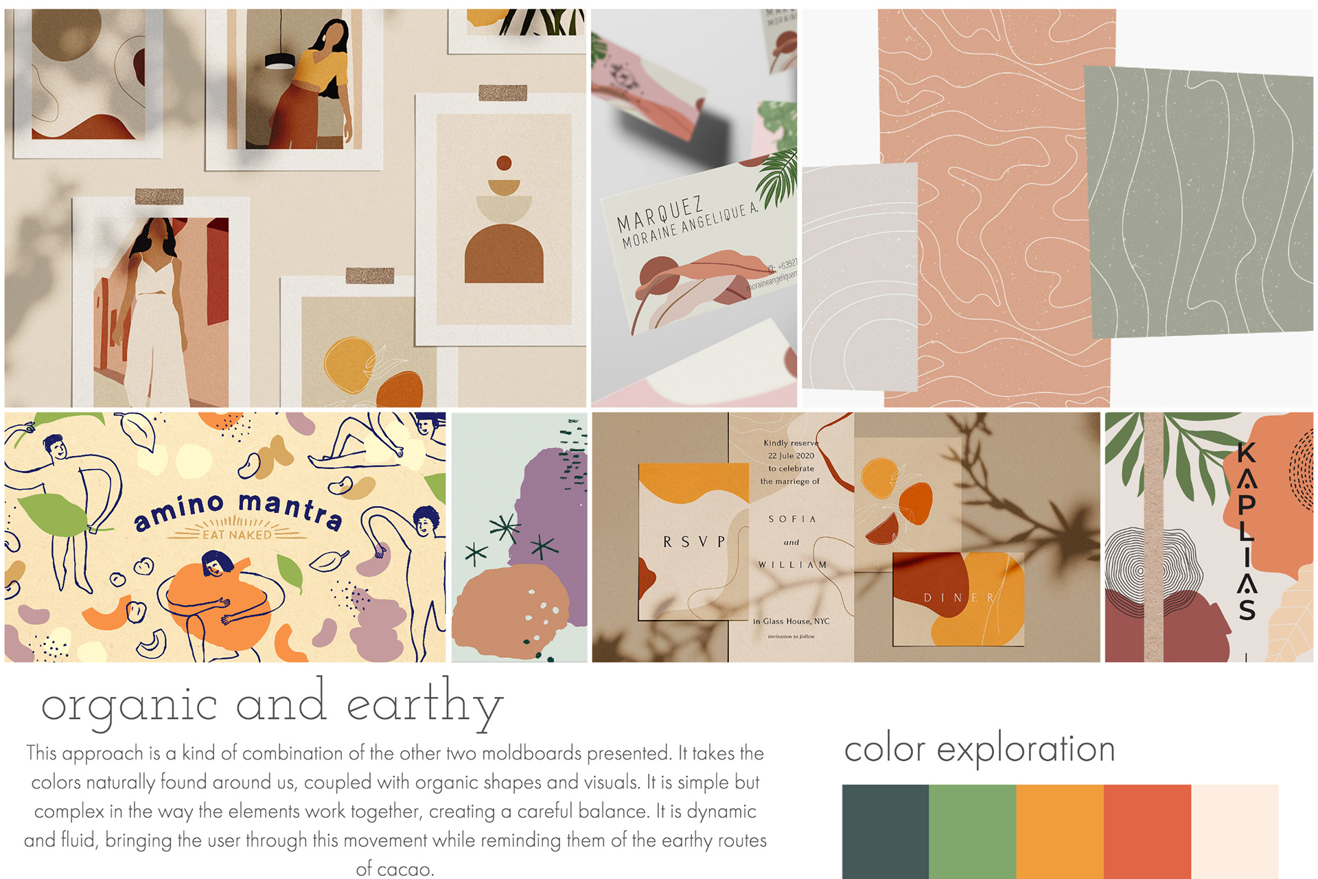
After conceptualizing the UI flow of the site, I explored three visual directions, creating moodboards for each. Each moodboard explores a different visual aesthetic for the site, informing the ultimate visual identity and language for the site.
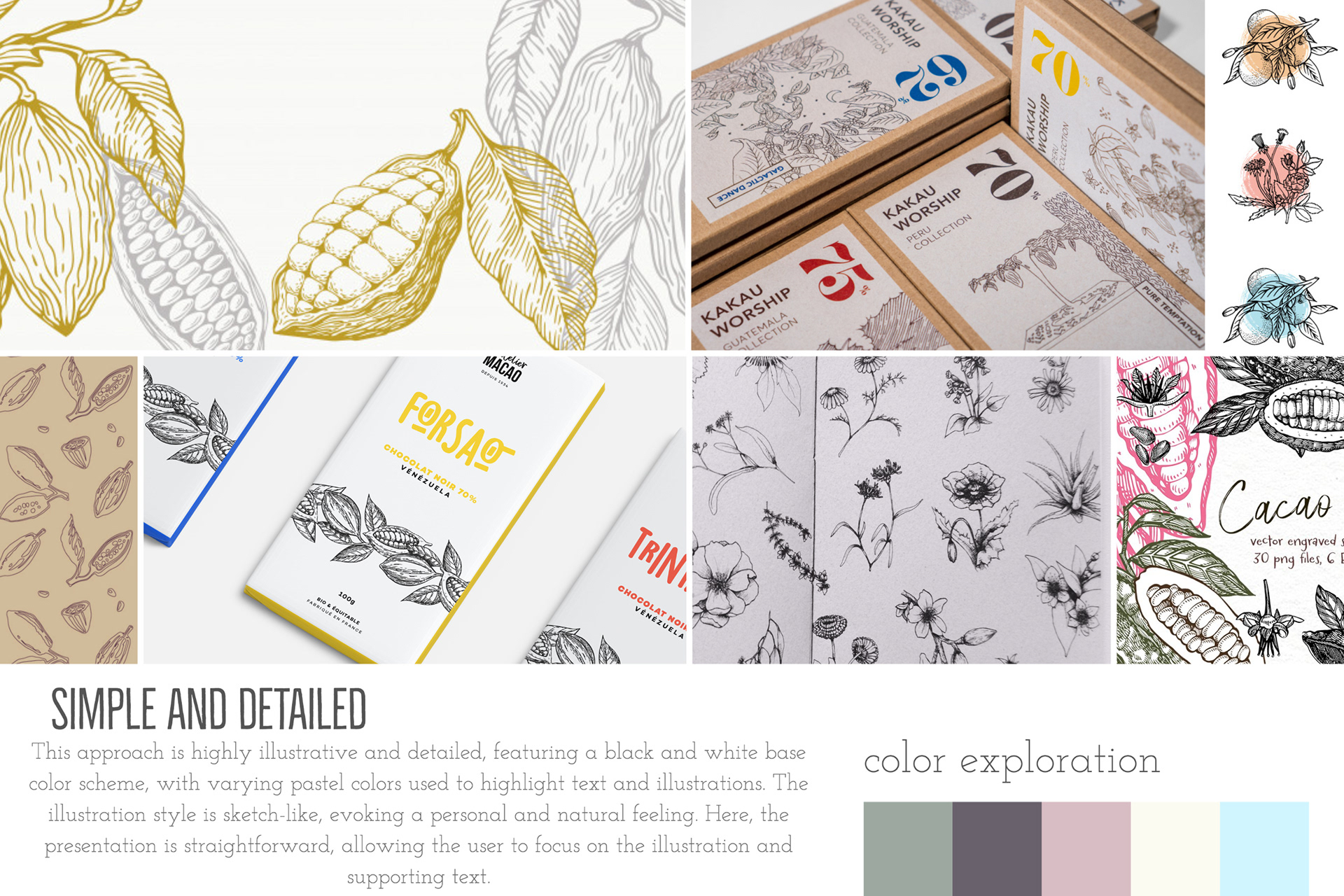
SELECTED MOODBOARD
I chose the following moodboard, "organic and earthy" as the direction for my site because I want the users of the site to be reminded of the organic and natural aspects of cacao as they browse the site. This moodboard embodies all aspects of cacao, from the organic orbs, resembling nature and the cacao pods themselves, to the colors derived from earthy tones, which also match the three main colors found in different types of cacao pods. This moodboard feels the most free-flowing and relaxed, which will help the user move through the site and utilize the continuous scroll feature.
Final Mockup
Finally, through combining my initial wireframes and moodboards, coupled with feedback on my initial designs and UI flow, I developed the following high-fidelity mockups.